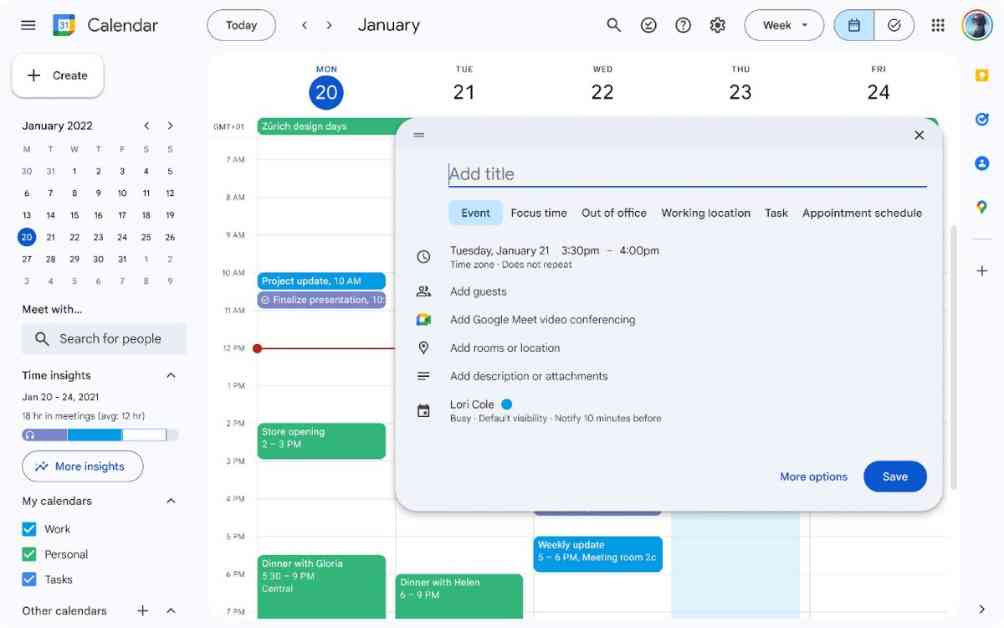
Google Calendar has recently undergone a major update, bringing a fresh new design and the much-anticipated dark mode feature. The revamp is in line with Google’s Material Design 3 guidelines, focusing on modernizing and enhancing accessibility.
One of the key changes in the update is the revamped controls like buttons, dialogs, and sidebars, which now feature rounded edges for a more contemporary look. The color schemes have also been updated to provide a more visually appealing experience. Additionally, icons and typefaces have been updated across the Calendar UI to ensure better legibility and clarity.
However, the most exciting aspect of this update is the introduction of dark mode. Users now have the option to switch between Light mode, Dark mode, or Device Default, allowing for a more personalized and comfortable viewing experience, especially in low-light environments.
Furthermore, Google has confirmed that these design updates will also extend to the task view list, providing a cohesive and seamless user interface. The update is set to be rolled out gradually over the next few weeks, so users can expect to see these changes implemented soon.
Overall, the Google Calendar update brings a fresh new look and improved functionality to the popular scheduling tool. With the addition of dark mode and other design enhancements, users can look forward to a more visually appealing and user-friendly experience when managing their schedules and tasks.


